Introduction
Creative Buttons gives you a remarkebale buttons inspiration.The button sets consists of some simple, creative and subtle styles made with Pure HTML5/CSS3/BOOTSTRAP-4 and effects to inspire you. Button's effect can be when hovering over a particular button or clicking it on. The background animation is a great way for end-users to enhance their nature to fit with a particular color. The markup of a button is genuainly straightforward. We just add specific shared classes: Code of Class like That numbered class are the shared styles for the sets. Each button has an additional specific class then. When using an icon, we add the icon-class which will use the pseudo element :before to add the character from the icon font. The class structure is used for demo purposes. I hope you enjoy the styles and find them inspiring!
Usage
Creative buttons are incorporated with clean code, highly responsive and can be compatible with any framework. These buttons consist of Pure HTML5/CSS3/BOOTSTRAP-4. Creative includes several predefined button styles, each serving its own semantic purpose, with a few extras thrown in for more control. Slight Animation is Used in Buttons that really improves it's performance while a User Interact with button. The Background Animation give a clear idea about compatibility of button with color or background image. These are just for DEMO Purpose and cannot be used in real button usage.
- Creative Buttons contains a set of 50+ meaningful and creative multipurpose buttons having unique design & social buttons with outstanding use of FontAwesome. The these set of buttons use in various formats.
- The markup of a button is really simple. We just add specific shared classes
How to use
General purposes top buttons DEMO
Creative Buttons are purely designed in HTML5/CSS3/BOOTSTRAP-4 with using FontAwesome library and can be customize easily. These Creative Buttons are used for various purposes.
Creative Buttons can be Arranged row vise which can be simply detected, each row has a collection of 5 buttons
After overview of usage of Creative Buttons in General Let's Dive into Using a Single buttons Using a single button can a simplified with the following steps.
- button have default css which can be easily customize from
css/default.css
-
index.html
There will be common styles for all the buttons are some resets defined in .btn and we use the specific numbered classes for the different sets of styles , you have to just target the desired button - to use general purposes creative buttons there will be seperate css file ,
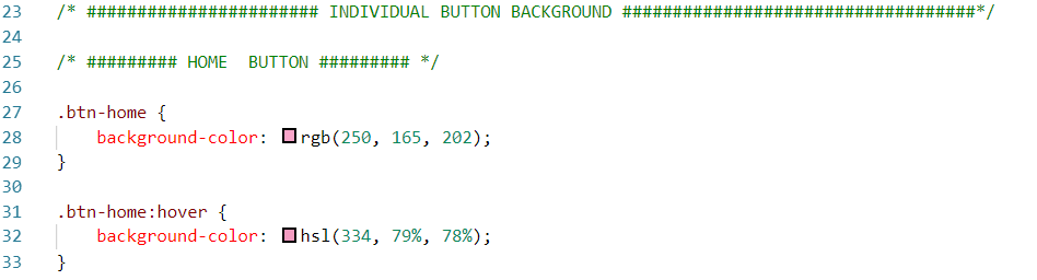
background color for each button you can simply change it.css/cre_component.css
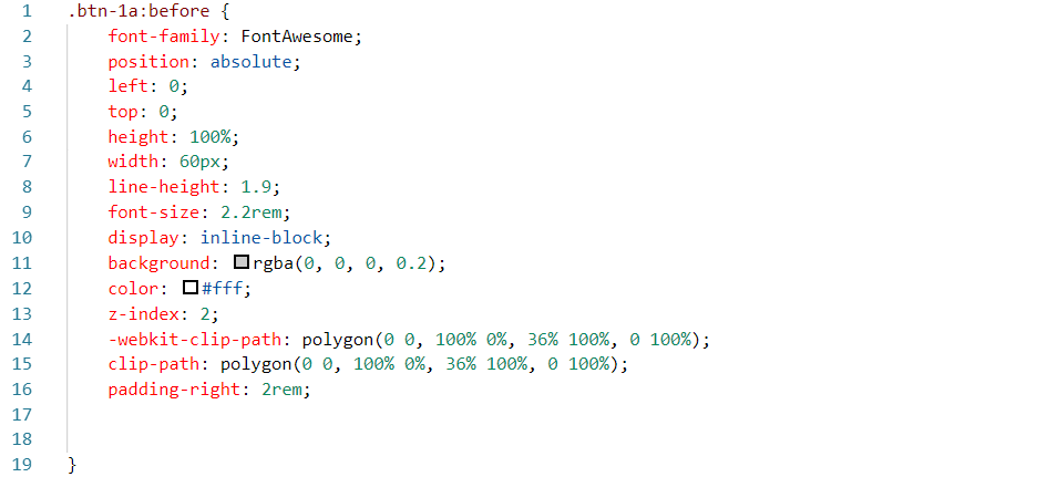
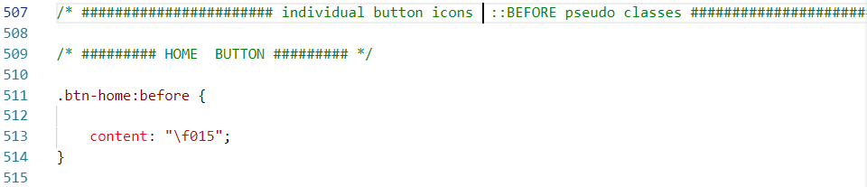
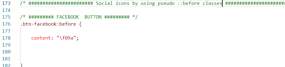
- When using an icon, we add the icon-class which will use the pseudo element :before to add the character from the icon font.
- to change icons for target button simply search the target button with class-name

Social buttons DEMO
Social Buttons can be Arranged row vise which can be simply detected, each row has a collection of 5 buttons
Social Buttons are used for Social purposes and can be customize easy. Each button can be customize by their specified class-name .btn-name.
-
index.html


- their will be seperate file for social buttons to customize
css/social_component.css
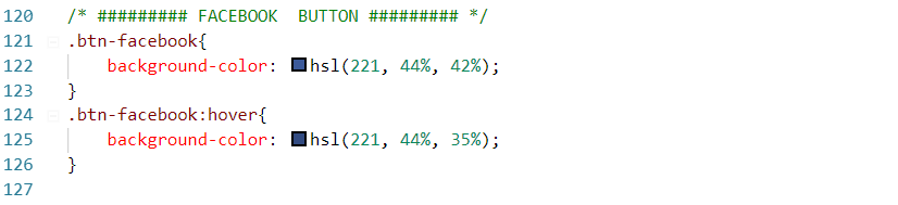
- each social buttons background can be customize by their specific name
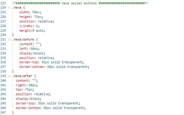
- There will be Square , Circle and Hexa shape buttons with the class-name of .btn-1 .btn-2 .btn-3 .btn-3a .hexa-button respectively. each button can be stylize with thier name in css/social_component.css file
- social icons can be place at each social button by using ::before pseudo class
- there will be seperate hexa shape Social buttons which can be place with the name .hexa in index.html and css as will
Our Support
That’s it for today. We hope you get something useful. If you like this , We hope you Support us so We can bring alot amazing stuffs more like this, Or better yet, . Thanks for reading. Did this article help you in any way? If you did, I hope you consider sharing it. You might help someone out. Thank you!